


I was late to the meeting, and what greeted me as I quietly stepped in was the Gartner Hype Cycle, projected through floating dust. That omnipresent curve with the tall peak and the long dip in the middle. A bright red dot sat at the bottom of the dip: “you are here”. I knew every soundbite that was about to be said in that room by heart, because I had heard them all before, in other rooms, about other dots.
The meeting was about a CRM system that had gone live some months earlier. The team that built it had been sure of their work, and the confidence was not misplaced: The system was, by any measure I could apply, the best possible version they could have built.
The active use dashboard, however, sat at fifteen percent. Only fifteen percent of the people the system was built for were using it, even though everyone had been trained and certified on it. And yet, they were running their day the way they had always run it: in spreadsheets, inboxes, and phone calls. As if the launch had happened to some other company.
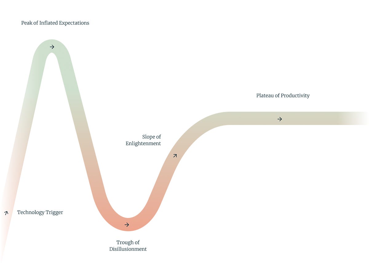
The consultancy that had built the system had several people in the room, and one of them, a senior consultant of perhaps twenty-eight, stood in the projector’s beam and walked the room through the curve with eloquence, grace, and empathy: the peak of inflated expectations, the trough of disillusionment, the slope up and out. “Adoption always dips after go-live,” she said; it is expected, it is in the literature. She may well have believed every word, but I didn’t. This made no difference: the slide did its job – to spin the catastrophic fifteen percent from a failure into a planned station on an anticipated path.

It is worth being precise about what was actually on that slide.
The Hype Cycle is not a natural law, but a marketing story. An analyst named Jackie Fenn drew it at Gartner in 1995 as a vivid way of talking about the trajectory of new technologies, one that would get people to subscribe to Gartner’s research services.
It was not based on research data and never substantiated its predictive claim. It was mostly built on narratives about how technology introductions went down in the ‘90s, when the world was first exposed to a new tempo of technological strides. It was also always about how technologies arrive in the market at large, not in a specific organization.
But because it is so poignant, so intriguing and relatable, it somehow hardened into canon. Now, three decades on, it appears in board decks and go-live meetings the way a geological survey appears in an engineering report, as if the peak and the trough were essential realities of the terrain that any serious plan must account for. “This,” consultants will have you believe, “is how technology introductions must go. And it is fine.”

As it was becoming more and more normative, researchers did eventually go looking for the cycle in the wild. The standard review – Dedehayir and Steinert, 2016 – found weak empirical support and no reliable mechanism. And when you read two decades of Gartner’s own annual cycles side by side, the railway dissolves under the train: most technologies placed on the curve never reach the plateau at all, and simply vanish from one edition to the next. Others skip phases, or jump backward, or appear once and are never seen again. Even in Gartner’s own editions, the trough of disillusionment behaves less like a mandatory stage that technologies pass through than like a common failure pattern, stylized into a planned stop and requiring nothing of anyone.
There is actual value to something like this, and it is anesthesia; the dip works like an epidural for bad rollouts. The technology falters, the technology recovers, and it was all just a phase, because you do not hold a train responsible for stopping at the station. So nobody holds the rollout team responsible either; everyone gets a second chance at saving face and making it work, and the twenty-eight-year-old senior consultant gets to sell additional trainings.
As someone who’s seen this run differently, without a dip, on a regular basis: the trough is what it feels like to discover (all at once, and under load) things that would have shown up in advance – if anyone had looked.
You see, the economists have a curve of their own, and theirs was measured rather than sketched. Erik Brynjolfsson calls it the productivity J-curve: when a genuinely new technology arrives, it is only one part of a fully functional purchase.
It reveals that a technology never arrives as a free-standing, monolithic investment: to function at all, let alone pay off, it needs to be flanked by “complementary investments”. These are unglamorous and routinely skipped housekeeping items, and researchers agree that these, rather than the purchased technology, are the actual asset being created, since they remain in place, functional and relevant even after the technology they accompanied is eventually replaced.
So what are these unglamorous, intangible investments? They’re things like a detailed assessment of the behavioral properties of the teams tasked with using the technology, so that the implementation can be tailored to them. Or the documentation of how processes actually run in the organization (as opposed to the version a tired room can agree to) so they can be tweaked to better extract the value of the new technology. Or the scoring of workplace routines that the new tool will displace, in order to understand how much the business will slow down in the first weeks with the new tech.
This is a massive correction of the traditional growth accounting framework, which merely contrasts the cost of an investment with direct potential gains, resulting in not only a more realistic landscape of both cost and potential, but also data that makes it possible to fully avoid Gartner’s unavoidable dip.
Once these costs are visible, some changes may need to be sequenced differently, or might turn out to not be worth making; the speed records in typing have mostly been set on the Dvorak keyboard layout, but the world types on QWERTY, because the shift would be too costly.
In essence, avoiding the dip is about reading, in advance and team by team, an organization’s absorptivity: how much new working reality it can take at this particular moment.
This absorptivity varies across the organization, and cannot be asked of a department head or read off an org chart, because it is impacted by the countless workarounds, side channels, and informal processes that remain invisible at the strategic level.
None of this is what organizations mean when they speak of assessed readiness. What they mean is the readiness assessment in the project plan: is there a steering commission, is there a training plan, are there enough licenses. These assessments can be green across the board and still reveal nothing about the teams’ capacity to bear the implementation during ongoing operations – or about the real cost of the complementary investments still due before the technology can work.

The readings of an absorptivity assessment tend to come back uneven: some teams can take the changes with little help, others are at capacity and would normally get flagged as “resisting,” just because they objectively can’t take on anything new.
This unevenness rarely sorts the way anyone expects it to: in one unit, the managers had spent months lamenting that the older colleagues would be the problem, that they would not go along fast enough. The absorptivity check said otherwise. The older colleagues had switched systems a handful of times in ten years and knew how to handle the strain. The junior colleagues meanwhile were still absorbing the larger learning curve of corporate life itself, and their first mastery of the outgoing system was hard-earned. “We had just found our stride with it,” one of them said, “and it was hard, and now you’re rearranging it all again.”
Nobody took the uneven reading as a reason to call the whole thing off. It became the shape of the plan. Each unit got a frame it could work inside, with enough structure to produce what the strategy needed, and enough room to enact it in a way that fits the realities of the teams on the ground. The complementary investment was sized to the reading rather than to the vendor’s performance narrative.
And in the end, there was no dip.

The people running the change spent only part of their budget. Trainings did not have to be repeated a year later, because the routines had formed the first time around. There was no trough to explain. And nothing about that was luck.
I still see the curve and the red dot everywhere, always when something is not going right, always saying the same thing: you are here.
It looks like navigation, and works like absolution: nobody is at fault, this is a station, the train will move again.
That is what the curve sells, why a thirty-year-old sketch is still projected onto walls: forgiveness, issued in advance, for everything nobody looked at.
The teams that look never need to huddle around the curve. They arrive somewhere quieter, where there is nothing to forgive.